Welcome To Our Little Big House On The Prairie


Showing posts with label wall art. Show all posts

Thursday, November 3, 2011

Its All About Family

Sorry for being so late today y'all, but I got a little sidetracked with a delightful long distance phone call with Nicole @ Davis Domestications and Furniture Face-Lifts.  If you haven't checked out her blog, you need to!  Nicole is absolutely wonderful and I had an awesome time talking to her - and picking her brain of all her furniture painting knowledge.  Thanks, Nicole!

So, yesterday was a whirl-wind of rearranging my living room to the detriment of every other room of my house and finishing up a project that I gave you a sneak peek of at Our Prairie Home on Facebook on Tuesday.  Its amazing how once you get started, how you get on a roll.  Its the getting started part that's the problem.  ;)

Anyhoo...

If you missed it, this is what I started with (some of which changed as the project developed and took me another route, as it so often does):


Paper Mache Letters (50% off HOLLA!)
Scrapbook Paper
Old Book Pages
Mod Podge
Mod Podge Acrylic Sealer
Spanish Moss
Glue Gun
Spray Primer
Dutch Boy Paint in "Chalk White"
Pittsburgh Paint in "Tall Cattail"
Acrylic Folk Art Craft Paint in "Driftwood"
Technique Glaze
Craft/Purdy Paint Brushes
Scrapbook Applique Flowers
and a few odds and ends from around the house.

Most of the supplies I just had laying around from other projects, so the cost was little.  Aren't those the best kind?!

I initially got my idea from Kelli @ Restore Interiors.  She made a sign for the wall in her booth at Urban Suburban that I absolutely adored!  And of course I thought, I can do that!

Restore Interiors

 So, when I suckered the hubs into stopping in at Hobby Lobby while we were in Waterloo last Friday, I got the makings for my own.  It took me a while to figure out what word I wanted to use.  Time and time again, I kept coming back to "Family".  Because as a SAHM, that's what's most important to me.

After working on and off on it for the last couple of days, I finally finished it up last night.  I looked at it up on the wall and realized that just hanging the letters up there wasn't going to work.  What to do?

Well, I just happened to have an old unfinished wood door to the hubs and I's chest of drawers upstairs that had fallen off due to the little man using it as a swing (Does this kind of stuff happen in your house too?  Please tell me it does!) and it wasn't repairable.  He ripped the hinge clean out and splintered the wood on one corner.  I decided to replace both sides with curtains, so I just had these two doors laying around up in the attic.

So at about 10:30 last night, I decided to sand it lightly, primer it, paint it with a sample of "Fairytale" blue by True Value Color Made Simple that I got for $1.25, distress it, and glaze it.  Thus my reason for being up until 2 am.  LOL!  I don't have any befores of the door, because the light was terrible for taking pictures since it was dark.  When I hot glued the letters to it this morning, I realized it was a fantastic idea!  And I completely love how it turned out!

You wanna see it don't you?

You want me to shut up and post the pictures, right?

LOL!

Okay!  Okay!  Here it is:

For some reason,
a few of the paper rosettes look a different color only in the pictures.
Drives me nuts, but I couldn't figure out how to fix it.
It doesn't look like that when you're looking at it.


Total Cost of Project:  $11.00

And for once, since I was rearranging my living room, it actually has a home on my wall instead of being stuck in a corner somewhere after I stage it.  LOL!


As you can see, I've done a TON of rearranging!  The buffet and rocking chair are now at home in the living room, as is the ladder.  We'll save that reveal for another day, but I've already taken pictures since who know's how long it'll stay in immaculate condition!  LOL  Since I've moved everything around,  I now have more space to buy more furniture for the dining room and office.  HA HA HA!  See, there is a method to my madness!  Are you wondering what's behind those pocket doors?  Let me tell ya, you don't even want to think about seeing what's behind Door #2.  The dining room is in a shambles - which, lucky me, I get to work on today.  I get the booby prize!  :P

Here's hoping y'all have an awesome day!

Monday, September 26, 2011

Calm. DIY Wall Art

Last week, I came across this inspiring wall art via Pinterest. . .


Sigh. is right!

Love the colors.  And the simplicity of the design and the message just make me take a deep breath and relax.  So, I decided I would attempt to copy this awesomeness myself and then put my own spin on it.

The first thing I did was get all my materials:

1)  22" x 28" Canvas  $6.99 on sale at Hobby Lobby
2)  Blank Stencils $3.99
3)  Acrylic Paint in Vintage White, Jamaican Sea, Calypso Sky, and Barn Wood.  $0.98 each on sale at Hobby Lobby
4)  Craft paint brushes (Already owned.)
5)  Exacto Knife (Already owned.)
6)  Painter's Tape (Already owned.)
7)  Pencil
8)  Tape Measure


Then I measured out where I wanted each section to end and taped it with the painter's tape.


Then I applied the Vintage White acrylic paint to the first section, brushing away from the tape to prevent seepage as she advised.


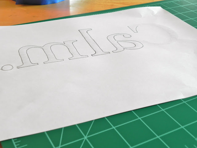
Before I got started, I decided what size and font I wanted to use for the stencil.  I chose Size 270 Georgia.  I decided to use the word "Calm" because that's how those colors make me feel.  While I waited for the paint to dry, I flipped the paper over and traced the letters.


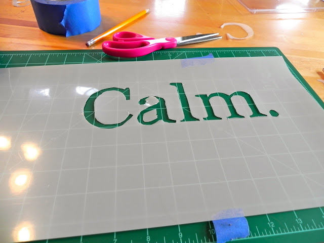
Then I traced it onto the stencil.


And cursed grumbled the whole time I was cutting it out with the Exacto knife because I pretty much suck at using it.  I can never get crisp lines, no matter how hard I try!  I was NOT calm.  I was extremely frustrated and had to walk away from it a couple of times.  LOL!

Note to Self:  Shaky hands from 3 cups of coffee doesn't help either.


Thankfully, I wasn't planning on actually stenciling it on, I'm just wanted to trace it.  So, a crappy cut-out isn't all that big of a deal.  I like the look of hand-painted signs, but I'm not that great at the lettering, so this is how I get around it.

Then really quick before I had to take Noah to his football game, I put on the middle color - Calypso Sky, and let it dry while I was gone.


For some reason, I did have some seepage with this color.  AGGRAVATING!  Why is it that you do the exact same thing and the first time it works and the second time it doesn't?  I put the tape on the same way.  Made sure I had a good seal.  Still got seepage.  Go figure.

Thankfully, it was an easy enough fix.  I just painted the Jamaican Sea by hand and carefully painted over it.


So, while I waited for it to dry (worst part of any DIY project), I began cooking dinner.  My bro-in-law had recently butchered a cow and sent some hamburger home with us.  Seriously.  He butchered it.  Himself.  He's got a neat little butcher set up on his farm and he does it all himself.  I'm sure if I had listened close enough, I probably could have still heard it mooing.  Gross, I know.  I don't particularly like to think about where our meat comes from - city girl that I am, meat comes from a grocery store.  Right?  But, my gosh!  There is nothing like fresh meat.  No preservatives.  Grain/Hay fed with no growth hormones.  Best cheeseburgers I've ever had!

Anyway. . .  Back to the project . . .  I'm super impatient, so I put a fan on it.  :)  It did take a couple of coats to be able to get complete coverage.  I probably should have used painter's acrylic paint, instead of a craft acrylic, but I couldn't justify $8.00 a tube for one project.  It worked though.

After the paint dried in half the time with the fan, I traced on the word.  Calm.


Then, I painted on the word in Barnwood.  I coated it on pretty thick with a small round tipped brush.  I wanted it to have some texture.


All in all, I'm pretty pleased with how it turned out. . .


I probably should have gone a little bigger with the font size, but I still think it looks pretty good. . .


My husband was pretty impressed that I was able to do it and was picking on me all afternoon.  "Who knew I had married an artiste?" with a fake french accent.  LOL!  I just rolled my eyes at him and kept painting.  He's even stopped giving me a hard time when I want some piece of junk or other from his parent's farm.  I cannot wait until this week's Friday's Finds.  You should see the stuff I've already scored and its just now Monday!  His parent's farm is a treasure trove of all things junk, since his Dad never throws anything away and I am finding some cool stuff, plus a couple of steals on Craigslist.  To.  Die.  For.

So anyway...

I hope your Monday is off to a good start.  Its a rainy day here in Iowa, so it doesn't look like I'll get a start on the buffet today.  :(  But, I've got a couple of things I can do indoors to keep me busy.  Starting with a weekend's worth of laundry.  Fun.  NOT.

But before I start that, I think I'm just going to sit here with my cup of joe and soak in the colors and the word.  I can only hope that the rest of my day is that way.  In the calm.  What a great place to be.


Tuesday, August 16, 2011

Motivating... DIY Wall Art

"Nobody who ever gave his best regretted it."
~ George  Halas

This quote, by George Halas, a pioneer in American professional football, are words we can all live by.  And it is also a very good summarization of something I always tells my boys before a game or a match:  "If you do your very best, you have nothing to be ashamed of.  All I care about is that you give 110% and have fun doing it."

On my last post, I showed you a picture of a few odds-n-ends that I picked up to work on a project for the boys' room:


A few months ago, I ran across this awesome little dealie on a blog while randomly looking for ideas for the Diva's room:


Here's the link for it HERE.

I completely fell in love with how it grabbed your attention with its boldness, yet it projects simplicity at the same time.  What a statement maker.  I also adore the message - from the Bible, as well as one of my favorite songs by Steven Curtis Chapman.

My first thought was to use the idea for the Diva's room, but thinking about it more, I decided to put something similar in the boys' room.  I wanted to use it as something that inspires them and keep it so simple that the words not only become a mantra because they see it so often, but also something they keep with them for the rest of their lives.  So, I decided to put my own twist on her original idea.

My first step was to purchase a piece of plywood from Menard's.  Luckily they have a help yourself section, and I had plenty of sizes and thicknesses to choose from.  I went with a 3/4" 4'x4' sheet knowing I had plenty of wall space to use.

I lugged that bad boy home (Thank goodness for my Yukon XL with its awesome storage space), up the stairs, and into the Diva's room that is, by necessity, becoming my workspace, while we wait for the skim coat to cure.  After layering newspaper on the floor, I laid the sheet flat and primed the entire surface.  I didn't bother roughing it up, as it was already pre-sanded.


Then, I waited overnight for it to dry.  I didn't get around to putting the first coat of paint on it until later that evening since we were busy.  I have a really great local True Value store, that helped me mix the exact match to U of I's Gold when I painted the boys' room a year ago.  They have it saved in their computer as "Hawkeye Gold" for me, so if I ever needed it again (which it turned out I did), they'd have it.

Unfortunately, one of the new kittens that we got last week got shut in the bedroom with the sign and decided to contribute her own artistic talent to my wall art.  Silver Lining:  That area will be covered by another coat of paint when I finish, so I didn't have do put on another coat of paint.  WHEW!


After painting, I began thinking about my lettering.  In her post on Pink Coffee PhotoArt, she used regular 6" letter decals from an office supply store.  I decided I didn't want to purchase that many decals because my saying is a little longer than her's.  I still had plenty of contact paper left over from using it on the basketball player's chest of drawers, so I decided to use that instead.

I went on my computer and found a font that I liked for the signage.  I went with IMPACT in a size 600 font and printed them out on my handy-dandy printer.

Something you might do, but I didn't think of is to figure out how many multiples of letters you have in the phrase or saying you're going to use.  It never even crossed my mind to do that, so I printed out all of the letters.  And OF COURSE, my printer ran out of black ink 4 letters short of completing the entire quote.  So, I had to stop in the middle of what I was doing and make a run to Wal-Mart.  Not to mention the amount of trees you'd save.  :)


Then, I went about tracing the letters onto contact paper.  It took me about an hour to trace all of the letters.


After tracing all the letters, I put each word into a pile and laid anything I could find that was heavy on it to flatten the letters out because they wanted to roll up.  I left them like that overnight.  Worked like a charm.


Finally I started on the task of using an X-ACTO knife to cut out all of the letters I had traced.  That took me about an hour and a half with breaks after every 3rd word.


I had to keep reminding myself that I wasn't going for perfect.  I found doing anything with a curve pretty tedious, but any straight lines were a snap.  I think I'll probably get better with that in time.  Plus, I want the wall art to have a home-made aged look to it.  I just kept repeating to myself when I would goof up:  "Its not supposed to look perfect."  Pretty hard giving that up for a perfectionist like me.

After I was done cutting out all the letters, I laid them out on the board to get a feel for where I should place the words, how many words per line, how many lines I would need, and spacing of the letters and the lines.


I'm really not sure why the camera makes the board look longer than it is wide, but it really is a true square.

My next step was to mark lines using a pencil to make sure each line was straight and evenly measured out.


I'm what I like to call leveling-challenged.  I can't draw a straight line even using a ruler.  My husband hangs all the pictures in the house.  I can't even tell that the line I've drawn is at an angle.  Its ridiculous!  And frustrating!  So, when I'm having to draw a straight  line, I first measure vertically from a straight edge and use hash marks across the surface I'm drawing on to make sure when I lay the ruler horizontally, I'm keeping it straight.  Each line was exactly 66 cm apart.  I don't know why I used centimeters, it just happened to be the side of the yardstick I was using.

Then I measured 4 across the width of the surface...

After painstakingly (I'm sure you'll be able to do it much quicker if you can draw a straight line), measuring out all four lines, I laid all my words out again to figure out the best placement of the letters.


Because I ended up with some extra space at the bottom, I went back to the computer and printed out an 8x10 of our school mascot, the Go-Hawk.  I thought that added a nice touch and was glad it turned out that way.  So I would remember where I had placed each word, I put a hash mark beside the first letter of each word and a line where the center of the Go-Hawk needed to be.


Next I began to apply the contact paper letters.  At first, I was kind of concerned  because the contact paper really didn't seem sticky enough to adhere to the painted plywood.  That actually turned out to be a God-send because then I was able to move them around quite easily and didn't have to worry about the letter getting stuck at an angle or spacing that wasn't right.  When I got the letter positioned properly, I used a credit card to smooth the letters and get out all the air bubbles, just as she advised on her blog at Pink Coffee Photoart.  It worked wonderfully!


Here's what it looked like once all the words were on:


I realized that the "O" in nobody is actually smaller, but I have no clue how I managed to do that.  However, I decided to leave it because I thought it looked neat (Read:  I told myself it wasn't supposed to be perfect anyway!").  It took me just under an hour to finish this stage.

The next part is pretty simple.  Just cover the entire piece of wood in your secondary paint color.  I, of course, went with black.


I chose to use a brush to apply the paint.  The idea is for the sign to look old and worn, so I wanted visible brush strokes in the paint. I have to admit, that at this point I was holding my breath because I wasn't sure if the contact paper adhered enough for the paint not to seep under it and ruin the crisp lines.

Here's what the board looked like completely painted with the 2nd coat:


At this point, I put a fan on it and closed the door on it.  It either would or wouldn't work, but boy I sure hoped it would!

Unfortunately, it did bleed the slightest bit.  Maybe I should have gone with the decals from the office supply store, but what do you do when something doesn't work exactly the way you planned?  You make it LOOK like it's supposed to be that way.  I ended up with an sign that looks like the yellow paint is peeling off the black surface.  WORKS FOR ME!  And in the end, perfect for a bunch of rough and tumble athletes.  Lord knows, nothing stays perfect for long in their room anyway!  ;)

Here's the final result:


Not too bad for a gal that has not one stitch of craftiness in her.  :)